WR Racing Tech Logo Design — Brand Identity Case Study
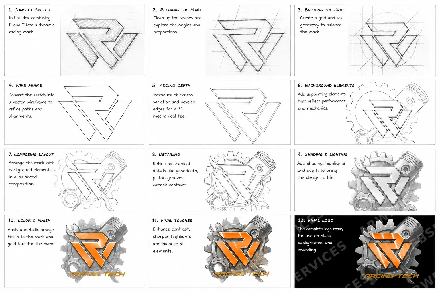
The Racing Tech logo was developed through a structured 12-step process that combines hand-sketched ideation with precision vector construction. The mark merges the letters R and T into a dynamic, triangular racing symbol.
Early stages focused on proportions and angles before converting the sketch to a vector wireframe. Depth was then introduced through thickness variation and bevelled edges to achieve a three-dimensional mechanical feel.
Background elements — gear teeth, pistons, and wrench contours — were composed around the mark to reinforce the performance and mechanics theme. Shading and highlights bring the assembly to life.
The final logo applies a metallic orange finish to the mark with gold lettering, ready for use on dark backgrounds across branding, apparel, and digital applications.